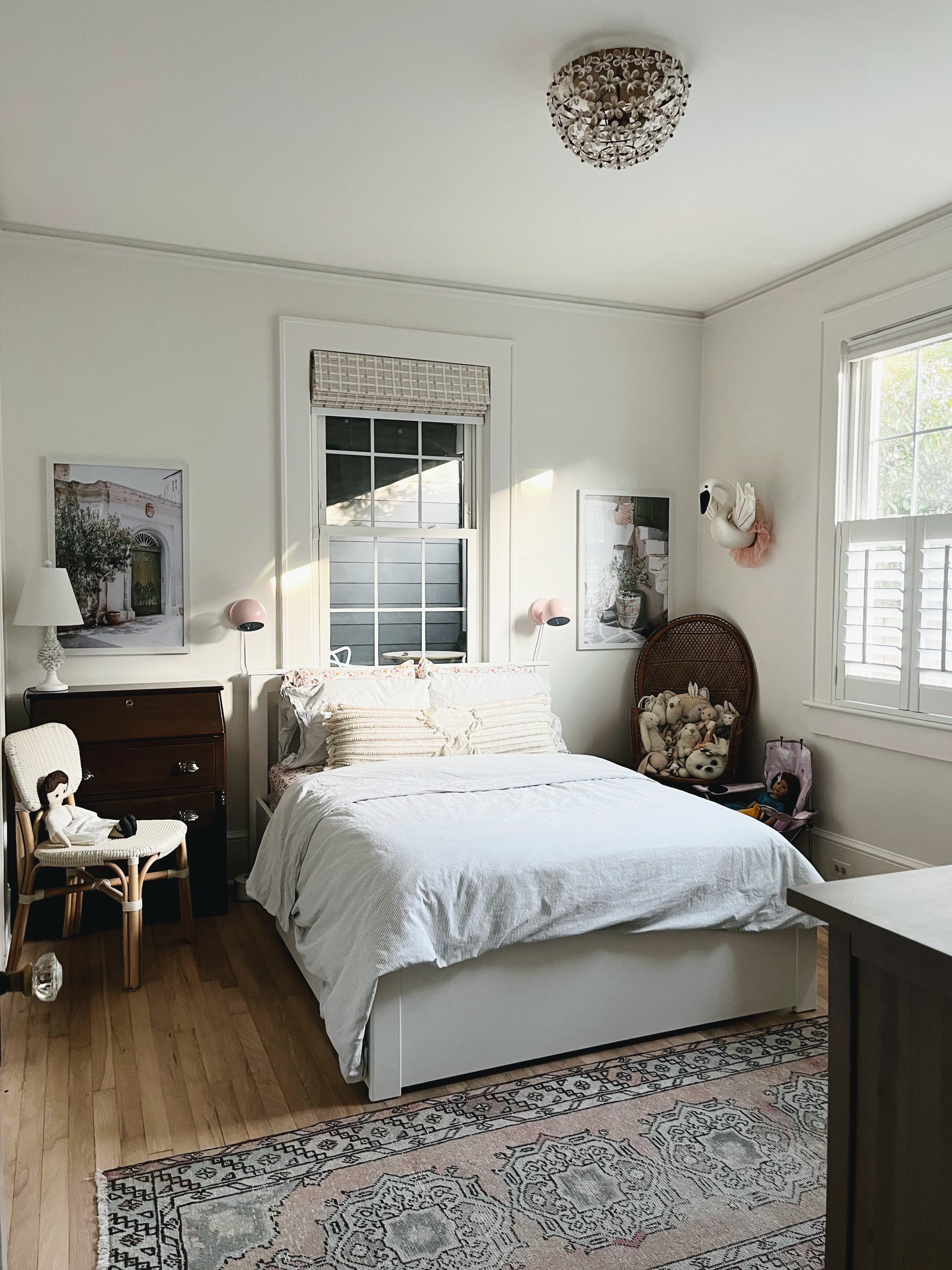
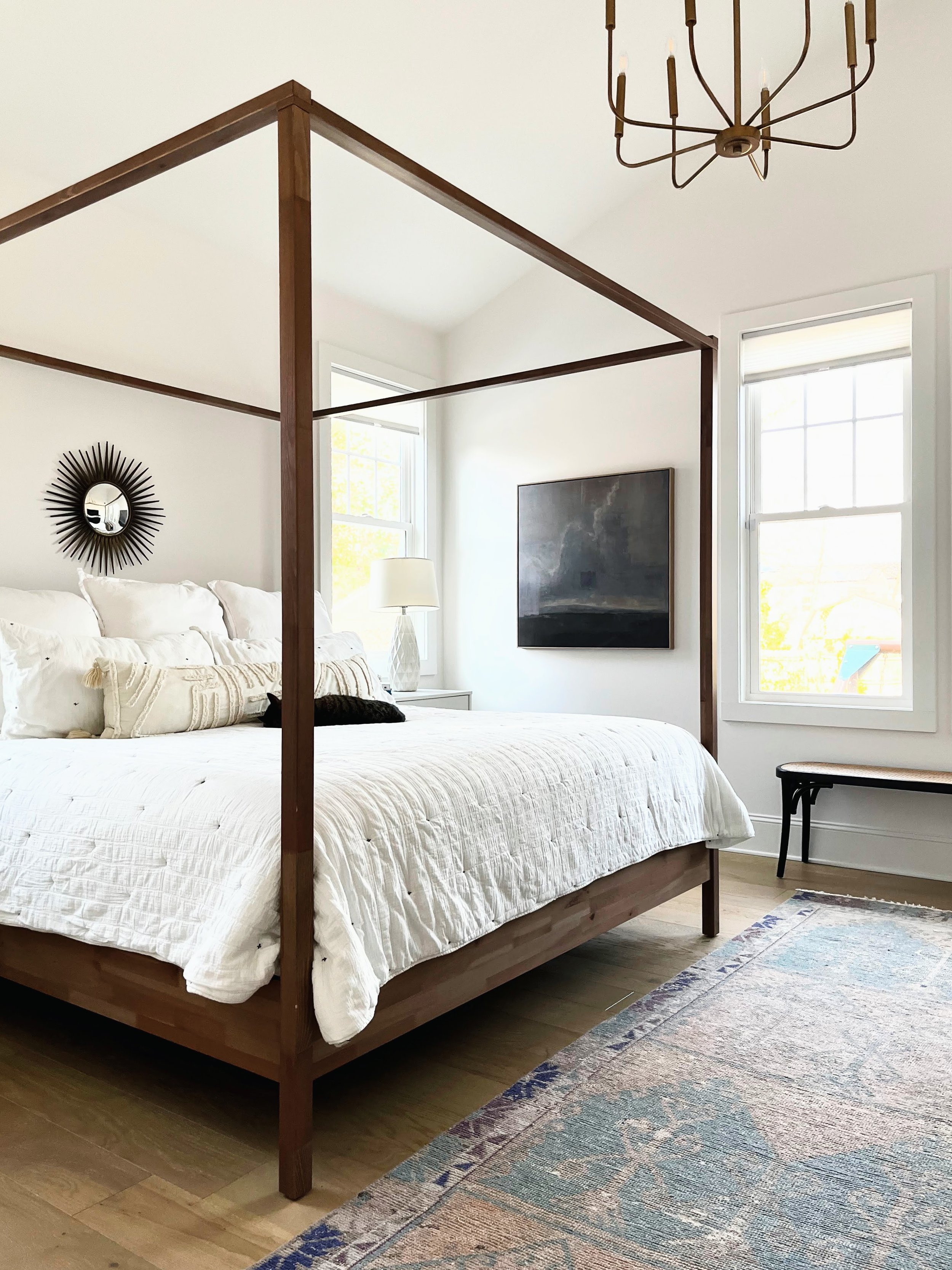
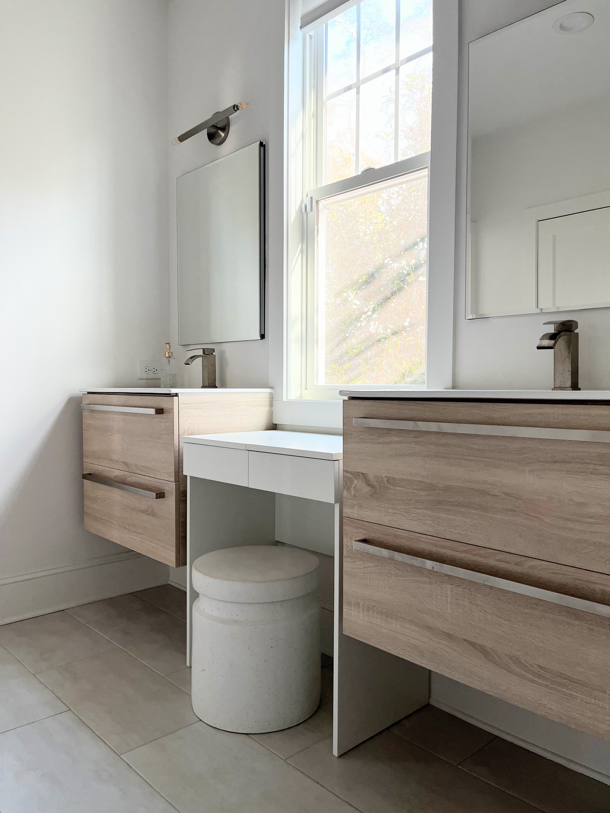
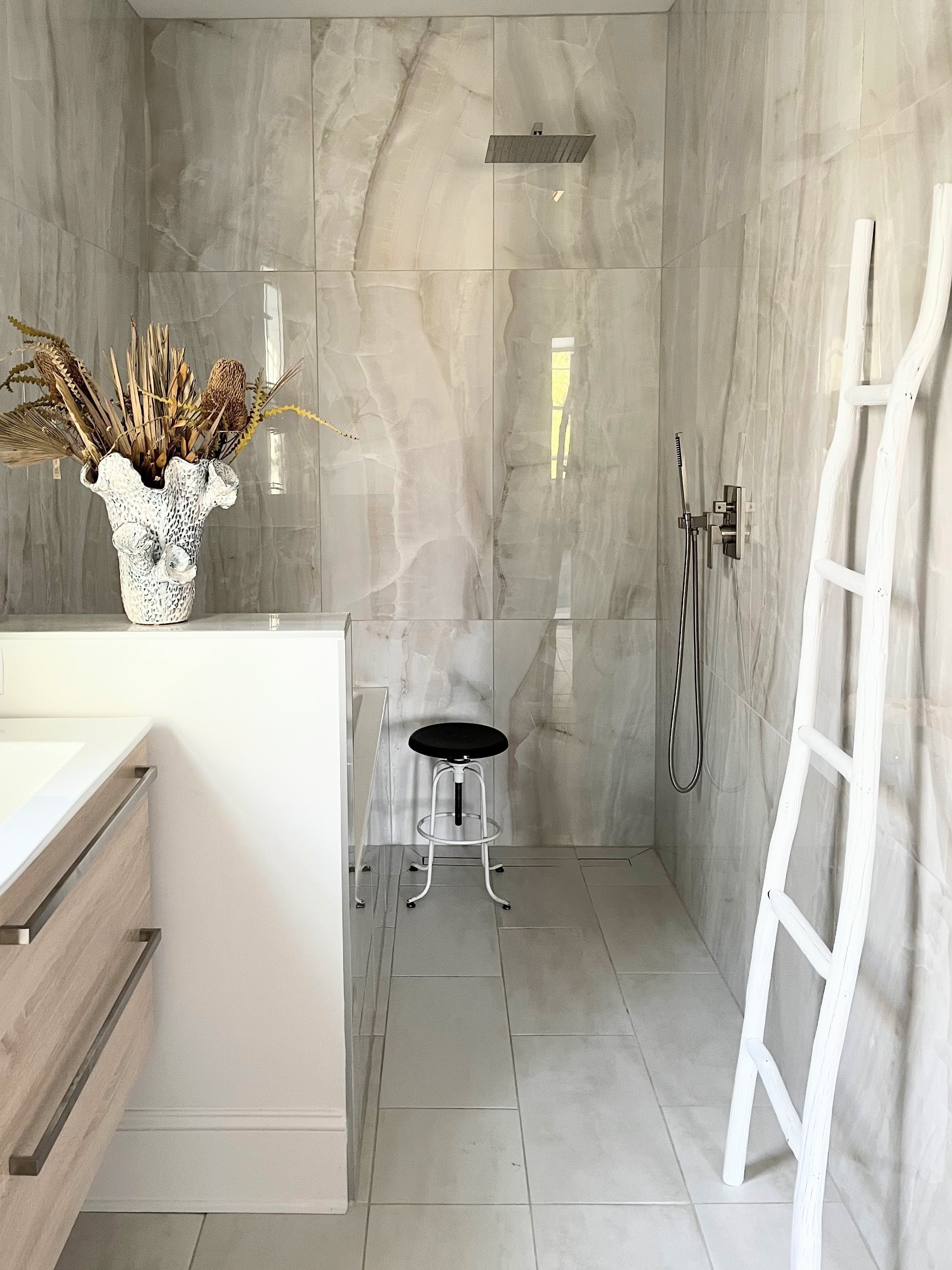
About me: Grew up in Greenville, and returned after college and some time in Alexandira, VA... Undergrad and Graduate degrees in Architecture from Virginia Tech.... I work as a designer with residential builder Milestone Custom Homes... mom of two young daughters... love travel, the arts, and history, all of which feed my design eye + curiosity
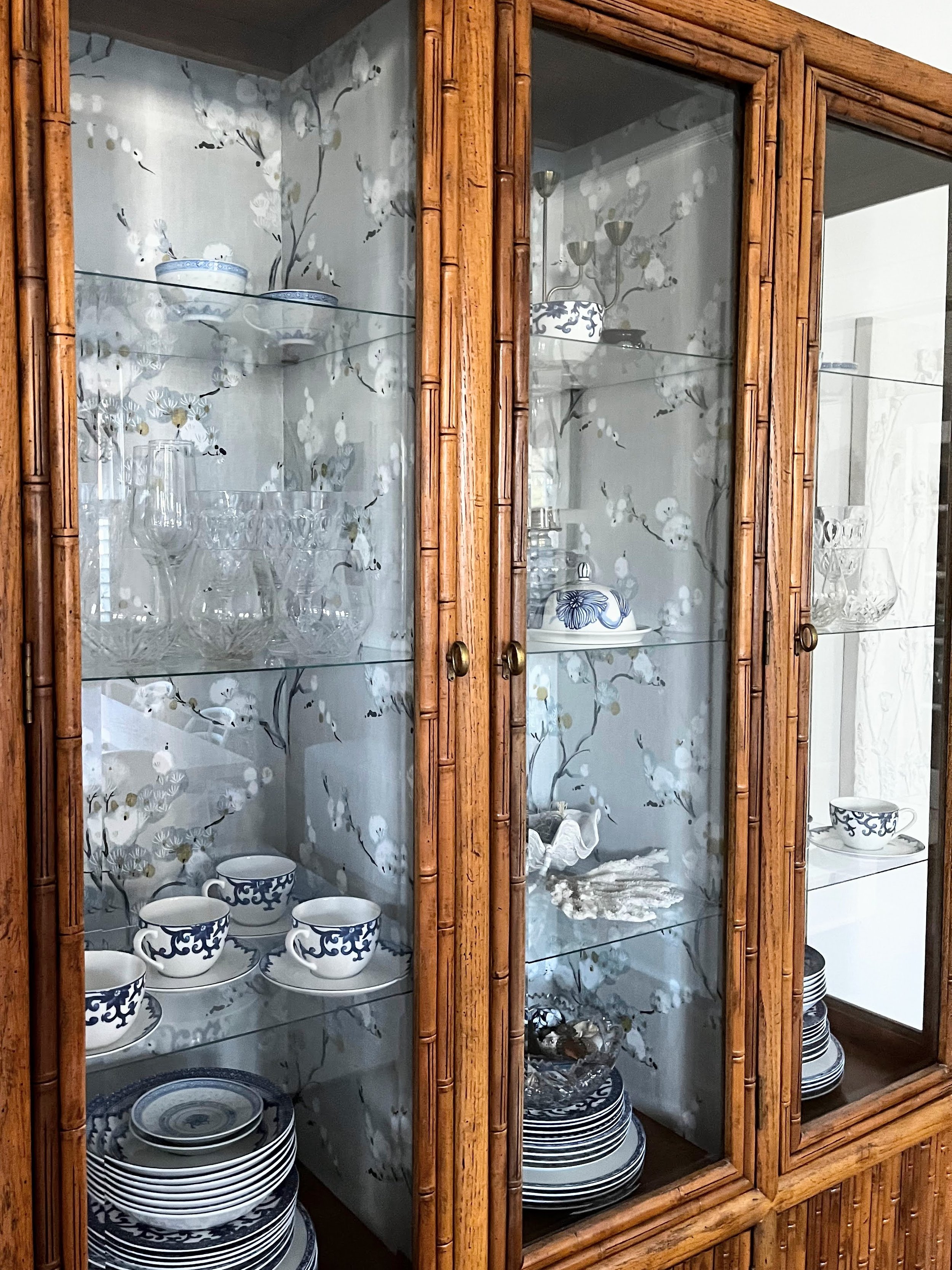
My home: The color palette is restrained, so the visual interest comes from a play of textures and the juxtaposition of classic and contemporary pieces.
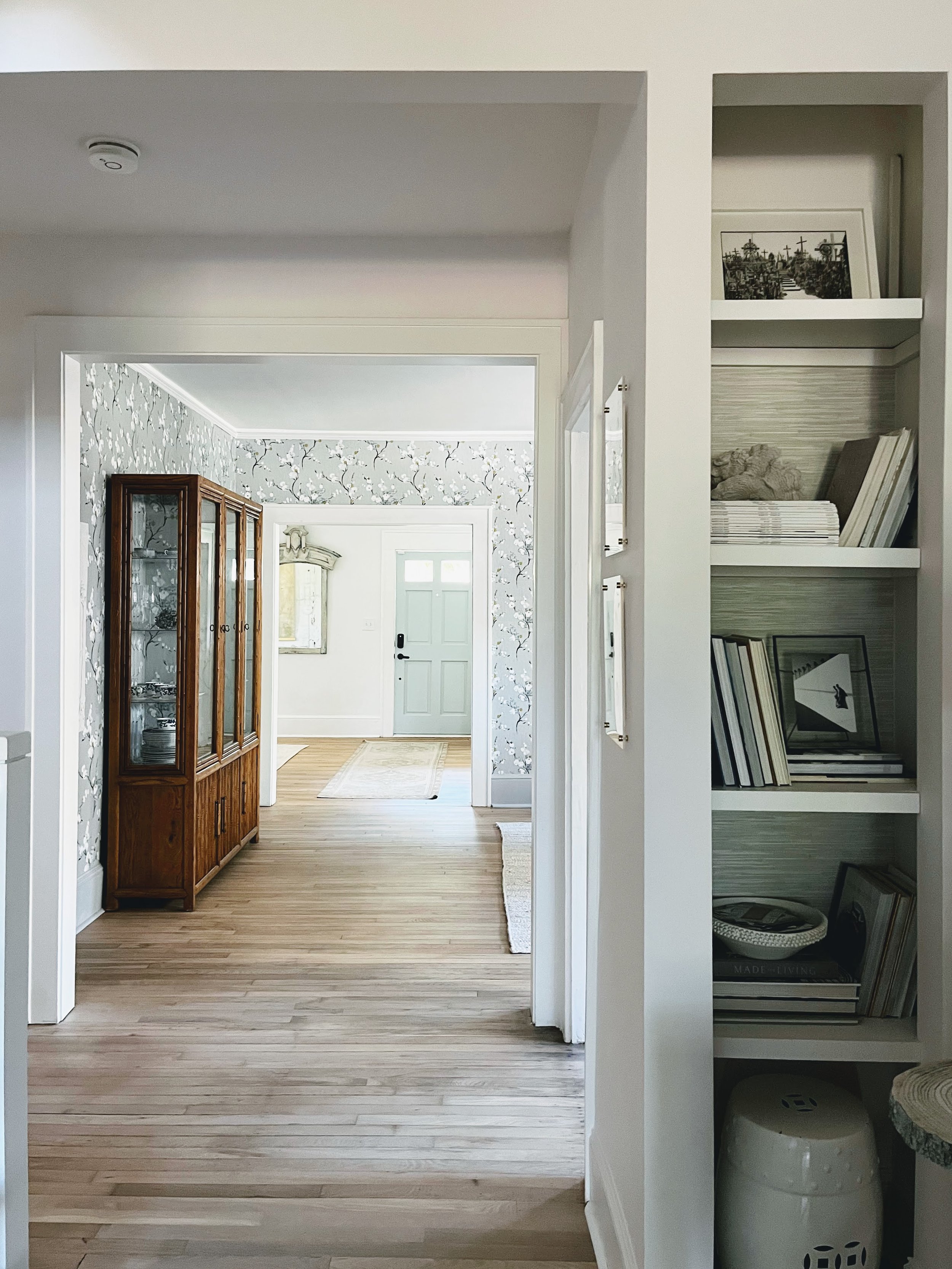
The front living room is the space that welcomes you when you enter the house, and many of the main living areas are visible from this room; It sets a vibe of airiness and clean/architectural lines, punctuated by whimsical touches.
Behind the vibe: My home is constantly evolving. It seems that each time I move or introduce a piece, there's a a domino effect- I'm always after a balance of scale, texture, and color. Though ever-evolving, it remains visually serene, and calms my multitasking brain.
Tips:
-INCORPORATE ONE OF A KIND FINDS FROM ANTIQUE STORES AND SHOPS LIKE ETSY. THIS PREVENTS THE ROOM FROM FEELING LIKE IT WAS DONE ALL AT ONCE, GIVING IT STYLE AND THOUGHTFULNES.
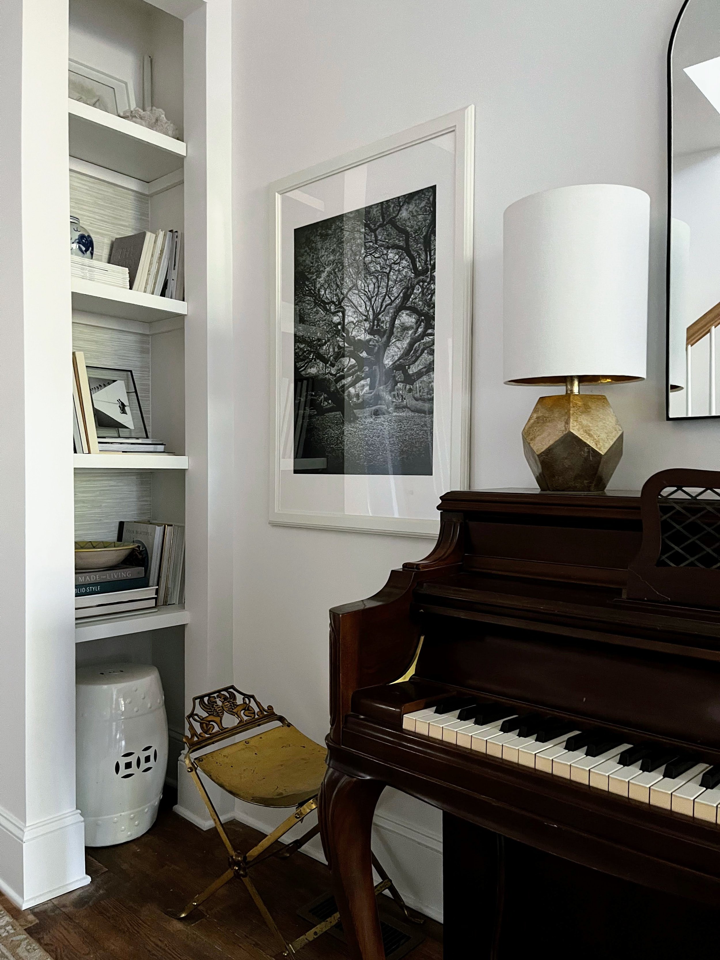
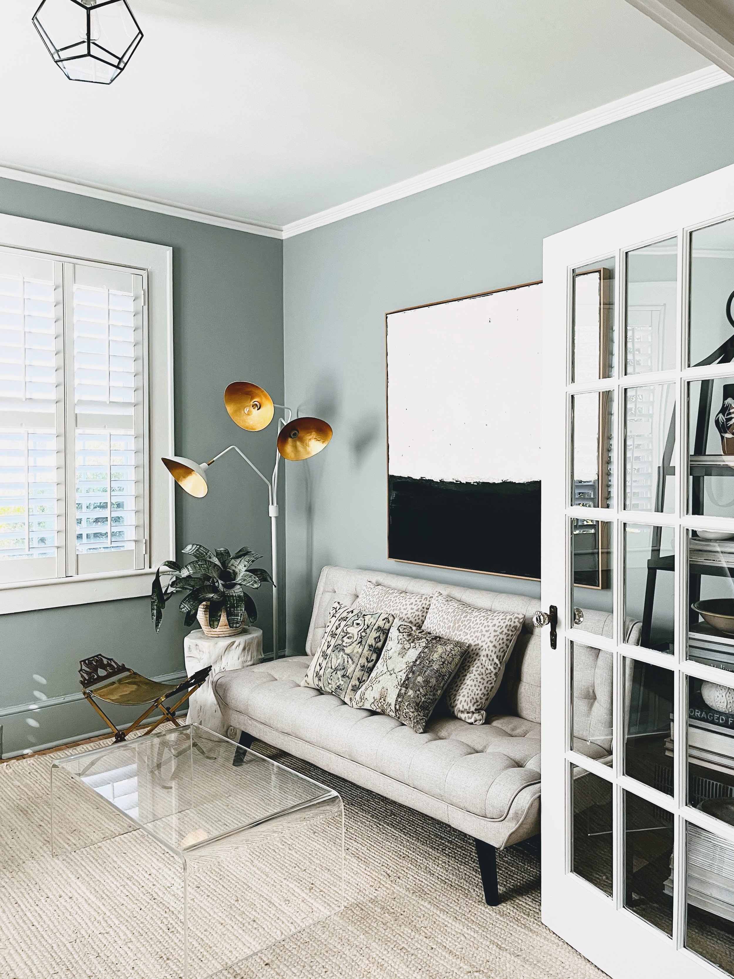
-CARRY A STATEMENT COLOR THROUGHOUT ROOM TO ACHIEVE BALANCE- HERE, IT WAS GOLD...
-IN A FLOORPLAN WHERE SPACES FLOW VISUALLY, MAKE SURE THERE ARE COMMON THREADS THAT TIE THE SPACES TOGETHER
-NATURAL FIBER RUGS ARE A COST EFFECTIVE OPTION THAT CAN SERVE AS A GOOD ANCHOR FOR OTHER PIECES, AND SERVE AS A GOOD BASE ON WHICH TO LAYER SMALLER/DECORATIVE RUGS
-LAYER LIGHTING FOR A COZIER EFFECT AT NIGHT
-IF YOU DON'T HAVE CONDITIONS FOR SYMMETRY, TRY TO ACHIEVE BALANCE THROUGH SCALE, COLOR, TEXTURE, ETC.
-LOW SEATING CAN MAKE CEILINGS FEEL LOFTY...
-CHOOSE SOME BIG STATEMENTS (3 SEEM TO WORK WELL), AND EVERTHING ELSE CAN BE SIMPLE


